-
 Project Curve Tracer - June Progress
- Date Tue 14 June 2016
- By Jason Jones
- Category curve-tracer
- Tags curve-tracer curve tracer git
Repository Adjustments

As the hardware is at the point of initial release, but the firmware and GUI aren't quite there yet, I decided that it would be prudent to split off the firmware and GUI components into their own GIT repositories. Tracking all files in the same repository was convenient through the initial stages of project development, but splitting them allows for more targeted releases and will likely make contributions easier. For instance, if someone wished to write a Java client, then they could simply fork the GUI repository and not worry about the hardware and firmware repositories.
As it stands, there are three repositories:
- hardware - dedicated to the KiCAD, gerber and BOM files
- firmware - dedicated to the C files that comprise the firmware of the microcontroller
- GUI - dedicated to the GUI (currently Python)
Hardware Progress
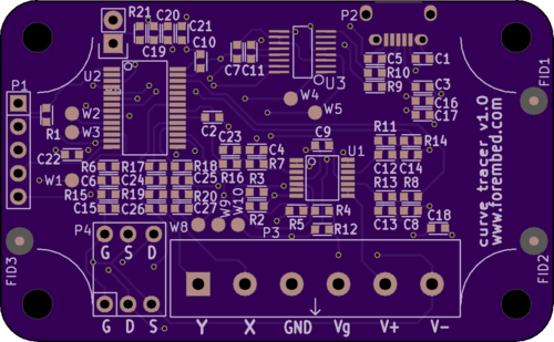
We have released v1.0 of the hardware! This release supports:
- Your choice of visualization, Oscilloscope or Desktop
- Use of XY mode available on most oscilloscopes
- Maximum of +/-5.0V on the probe outputs
- Gate voltage application of up to 5.0V
- Transistor base current of up to 10mA
- Uses USB for the power supply (connects as Virtual COM Port)
Once the firmware and GUI catch up wit the hardware in maturity, we will create a curve tracer page in the references to get you up and running quickly!
Firmware Progress
Minor improvements and functionality have been added to the firmware. Specifically, two XY outputs were added to support the oscilloscope XY mode. These are simply PWM outputs that reflect the measured component voltage and current. There have been some small bug-fixes and improvements, but the firmware has been working well for some time now and is nearing that 'v1.0' milestone.
Client GUI Progress
The Client has shown the most progress in recent weeks. We can save a live plot as a CSV file, recall that plot, and erase it. We can also 'run' and 'pause' the live plot as needed.
We have also filled out the menus for 'file', 'edit', and 'help', which contains all of the functionality of the shortcut bar, plus a couple of extra less-used features. Oh, and take a look at the status bar! Lots of new display features there, continually updated by the hardware.
In short, the GUI is already quite useful for live plotting and is getting features added as time goes on.
I have encountered an issue that I'm unsure of how to deal with. I am experiencing an optimization problem during plotting that I have described on StackOverflow. It seems that plotting each point is taking more time than I thought it might. I don't see a quick and easy fix for this at the moment, particularly since it is working well, but I am hoping that someone else might have some insight into how to make this process a bit more efficient.
Evolution of the Visualization
I must admit that it was quite exciting to get the initial plots to the screen, but looking back a bit, it is even more exciting to see where we have been on the hardware and software as it has evolved. I would like to take a moment to look back on the screenshots from the time that we got to the first visualizations until the present moment.
The first visualizations were crude, at best. In this first version, we found that we didn't even have all of the points displayed on the screen, but we could see that the hardware was basically working, just not very well:

Firmware improvements got us a few more points on the screen and a complete waveform:
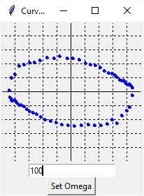
An improvement to the GUI added some functionality. In addition, the screen now looks a bit more like ye old CRT:
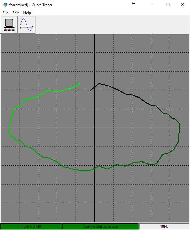
Hardware improvements greatly reduced the noise:

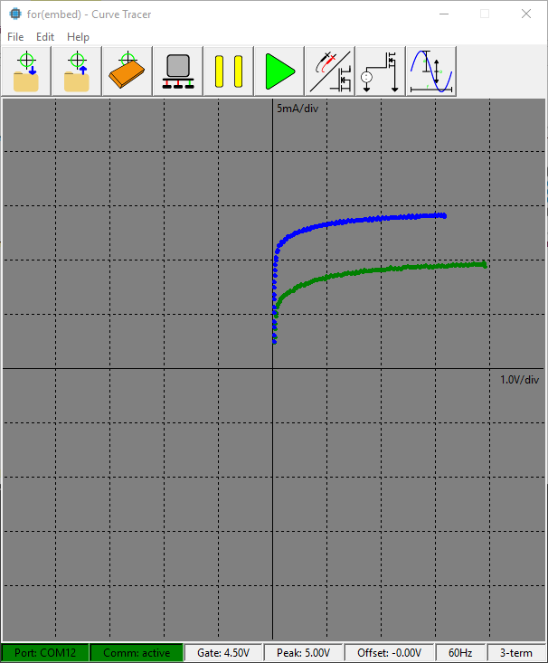
Finally, we doubled the resolution of each point along with doubling the number of points on the screen. We also added adjustments to the waveform, gate voltage, two-terminal/three terminal modes, and status updates across the bottom:
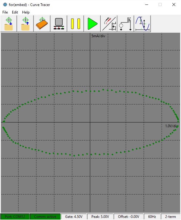
We changed from lines to dots so that we would easily be able to see the data density. Using lines tended to obscure that. We would also like to re-add the color coding so that we could see the directionality of the waveform, particularly when there is reactance present. A capacitor and inductor will have opposite directions and that information can be useful for troubleshooting.
We look forward to a complete v1.0 package!
- article
- current-sensor
- curve-tracer
- dispatch
- fan-controller
- fixed-point-math
- load-cell-sensor
- meta
- reference


 RSS
RSS
2
assembly
5
buffer
31
c
3
current sensor
28
curve tracer
2
fan controller
6
fixed-point math
4
interrupt
3
KiCAD
3
labview
5
layout
6
msp430
4
pelican
18
pic24
29
project
12
python
2
Q1.15
4
schematic
10
serial
3
solidworks
2
task manager
2
theme
3
tkinter
9
uart
9
xc16